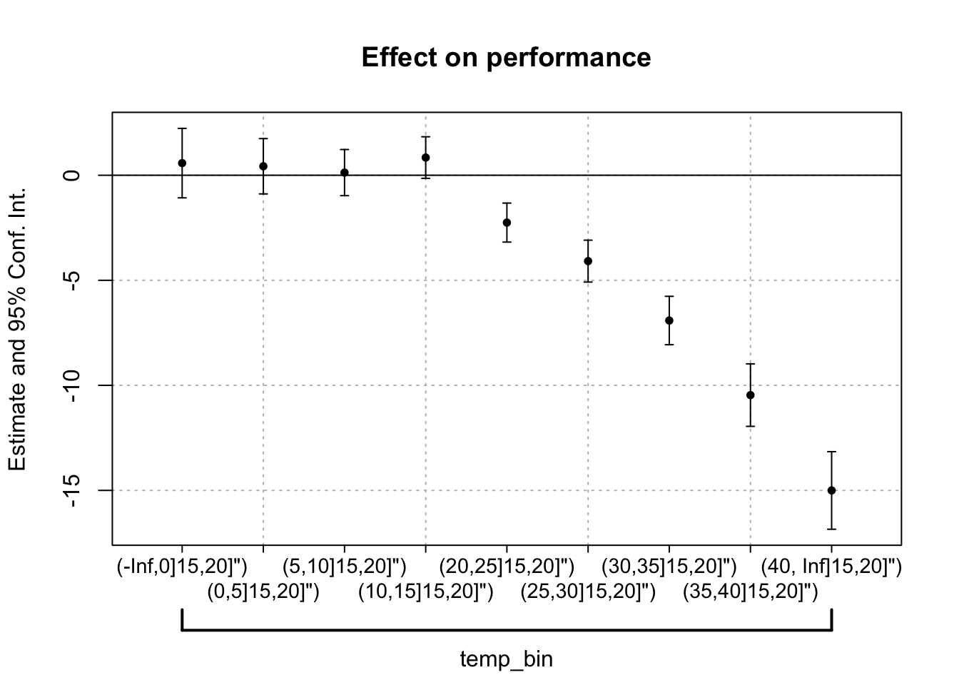


How to plot a specification curve
R
visualization
econometrics
Scoring texts for the presence of phrases
R
text-analysis
programming

A list of gists
reference
code-snippets
github

Things I forget: readr shortcuts
R
data-import
reference
Debugging in R, RStudio
R
debugging
productivity
Nominatim for offline geocoding
geocoding
tools
postgresql

No matching items